Quality Advisor
A free online reference for statistical process control, process capability analysis, measurement systems analysis,
control chart interpretation, and other quality metrics.

SPC DEMO
Don’t miss out! Book a demo of our specialized SPC software and unlock immediate improvements in your processes.
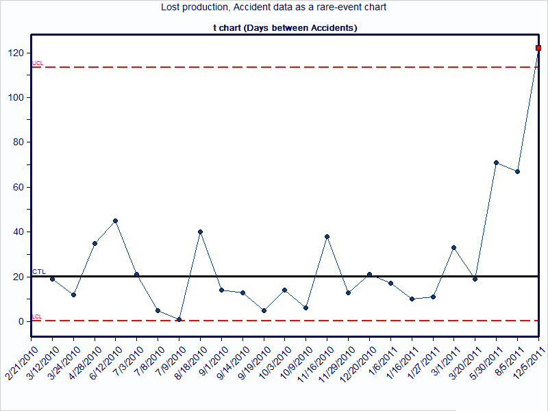
t-chart
What is it?
The t-chart creates a picture of a process over time. Each point on the chart represents an amount of time that has passed since a prior occurrence of a rare event. The time unit might be hours, days, weeks, months, etc. For example, a chart might plot the number of days between infection outbreaks at a hospital. A traditional plot of this data may contain many points at zero and an occasional point at one. A t-chart avoids two types of mistakes: over control and under control that a traditional control chart might generate.
The t-chart helps to identify the two types of variation present in a system, special and common cause, so that appropriate improvement actions can be taken. Specific formulas for t-chart control limits are used with this type of data. T-charts can be created using software programs like SQCpack.
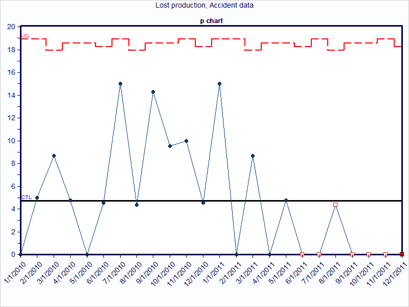
What does it look like?
By way of contrast, consider the information that is provided with a chart of lost production due to work time accidents. The chart shows many months where there were no occurrences of lost production. Thus, this chart is not beneficial and provides little insight to know if the process changes resulted in improvement.
Now consider the same data using a t-chart. Instead of plotting the lost production each month, plot the days passed since the last time of lost production. The data is still being collected and charted, but the method used to analyze the information is different. This shows that an improvement is occurring (or has occurred), with the days between lost production increasing.