What is it?
A Pareto diagram is a simple bar chart that ranks related measures in decreasing order of occurrence. The principle was developed by Vilfredo Pareto, an Italian economist and sociologist who conducted a study in Europe in the early 1900s on wealth and poverty. He found that wealth was concentrated in the hands of the few and poverty in the hands of the many. The principle is based on the unequal distribution of things in the universe. It is the law of the “significant few versus the trivial many.” The significant few things will generally make up 80% of the whole, while the trivial many will make up about 20%.
The purpose of a Pareto diagram is to separate the significant aspects of a problem from the trivial ones. By graphically separating the aspects of a problem, a team will know where to direct its improvement efforts. Reducing the largest bars identified in the diagram will do more for overall improvement than reducing the smaller ones.
There are two ways to analyze Pareto data depending on what you want to know:
Counts Pareto: Use this type of Pareto analysis to learn which category occurs most often, you will need to do a counts Pareto diagram. To create a counts Pareto, you will need to know the categories and how often each occurred.
Cost Pareto: Use this type of Pareto analysis if you want to know which category of problem is the most expensive in terms of some cost. A cost Pareto provides more details about the impact of a specific category, than a count Pareto can. For example, suppose you have 50 occurrences of one problem and 3 occurrences of another. Based on a count Pareto, you would be likely to tackle the problem that occurred 50 times first. However, suppose the problem that occurred 50 times costs only $.50 per occurrence ($25 total) and the problem that occurs 3 times costs $50 each time ($150 total). Based on the cost Pareto, you may want to tackle the more expensive problem first. To create a cost Pareto, you will need to know the categories, how often each occurred, and a cost for each category.
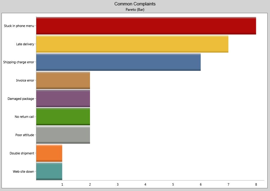
What does it look like?
An example of a counts Pareto diagram is shown below.
When is it used?
Use a Pareto diagram when you can answer “yes” to both these questions:
- Can data be arranged into categories?
- Is the rank of each category important?
Getting the most
Despite its simplicity, Pareto analysis is one of the most powerful of the problem-solving tools for system improvement. Getting the most from Pareto analysis includes making subdivisions, multi-perspective analyses, and repeat analyses.
Subdivisions are useful when data has been first recorded at a very general level, but problem solving needs to occur at a more specific level. A retail chain manager might create a Pareto diagram for all the customer returns of furniture by store in his district. Once he or she has identified the store which contributes most returns to the total, the next step might be to analyze that store’s returns by furniture type. If “chairs” turned up as the biggest category of furniture returns for the store in question, yet another Pareto of chair returns might help to discover whether dining room chairs, occasional chairs, wooden chairs, or upholstered chairs were being returned more frequently. Because the Pareto principle holds for subgroupings of data, such successive analyses can be performed to help teams target small elements of a large problem.
Multi-perspective analyses are useful when data can be stratified or subdivided in several different ways. The retail manager might study customer returns of furniture by number of units and again by cost. A store might discover that chairs have accounted for the majority of items returned over a period of time, but that fine dining sets accounted for the majority of cost. Depending on priority, the problem could be attacked to reduce either the highest frequency or the highest cost item. The district retail manager might study his or her district-wide furniture returns by store, by lot number, by furniture type, by cause for return, by frequency, by cost, by salesperson, by delivery carrier, or by any other set of categories he or she thinks may reveal opportunities for improvement. Multi-perspective Pareto analysis helps assure that a set of data is reviewed from all angles and that many explanations for variability are considered.
Repeat analyses are useful when improvement activity is underway and performance data is changing over time. If the retail manager worked with the store’s delivery staff to reduce the number of fine dining sets being damaged and subsequently returned, it would be useful to repeat an earlier Pareto analysis using more recent data to see if the target category has shrunk. Depending on the cycle of data collection—hourly, daily, weekly, monthly, quarterly, or other—repeated Pareto analyses help to monitor the improvements made to the system producing the data.
Caution is in order for users of Pareto analysis who have not monitored the systems they are studying for stability. A wildly fluctuating system will produce inconsistent Pareto rankings that can lead to misjudgments. If, for example, the retail manager failed to note that customer furniture returns varied greatly from month to month, the ranking of categories may be entirely different in a month with high returns from those of a month in which returns were unusually low. Repeated Pareto analyses can help to confirm rankings, but the most effective protection against being misled is to first use a control chart to tell if the system is stable and predictable.