What is it?
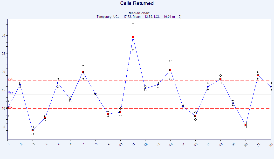
A median chart is a special purpose variation of the X-bar chart. This chart uses the median instead of the subgroup average to show the system’s central location. The median is the middle point when data points are arranged from high to low. The chart shows all the individual readings. Use charts to determine if the system is stable and predictable or to monitor the effects of process improvement theories.
Although median charts show both central location and spread, they are often paired with range charts.
What does it look like?
The median chart shows each reading in a subgroup. Subgroup medians are connected by the data line and are used to analyze the central location.
When is it used?
Use the median chart when you want to plot all the measured values, not just subgroup statistics. This may be the case when subgroup ranges vary a great deal, as showing all the points will emphasize the spread. It shows users that individual data points can fall outside the control limits, while the central location is within the limits.
Use the median chart when you can answer yes to these questions:
- Do you need to assess system stability?
- Is the data in variables form?
- Is the data collected in subgroups larger than one?
- Is the time order of subgroups preserved?
- Do you want to see individual data points?
Getting the most
Collect as many subgroups as possible before calculating control limits. With smaller amounts of data, the median chart may not represent variability of the entire system. The more subgroups you use in control limit calculations, the more reliable the analysis. Typically, twenty to twenty-five subgroups will be used in control limit calculations.
Median charts have several applications. When you begin to improve a system, use them to assess the system’s stability.
After the stability has been assessed, determine if you need to stratify the data. You may find entirely different results between shifts, among workers, among different machines, among lots of materials, etc. To see if variability on the median chart is caused by these factors, you should collect and enter data in a way that lets you stratify by time, location, symptom, operator, and lots.
You can also use median charts to analyze the results of process improvements. Here you would consider how the process is running and compare it to how it ran in the past. Do process changes produce the desired improvement?
Finally, use median charts for standardization. This means you should continue collecting and analyzing data throughout the process operation. If you made changes to the system and stopped collecting data, you would have only perception and opinion to tell you whether the changes actually improved the system. Without a control chart, there is no way to know if the process has changed or to identify sources of process variability.
Variables data is normally analyzed in pairs of charts which present data in terms of location or central location and spread. Location, usually the top chart, shows data in relation to the process average. It is presented in X-bar, individuals, or median charts. Spread, usually the bottom chart, looks at piece-by-piece variation. Range, sigma, and moving range charts are used to illustrate process spread. Another aspect of these variables control charts is that the sample size is generally constant.
Use the following types of charts and analysis to study variables data:
These charts, and more, can be created easily using software packages such as SQCpack.